
 Posted By
Bajarangi soft ,
Posted On 08-10-2020
Posted By
Bajarangi soft ,
Posted On 08-10-2020
Method 1: Using border-image with gradient:
The border is created by using the size and color as transparent in the border property. The gradient is used to define the border-image property. The border-image-slice is set to 1 for a border to properly be displayed. This combination of properties creates a gradient border.
Syntax:
.border {
width: 400px;
border: 3px solid transparent;
border-image: linear-gradient(to right, green, lightgreen);
border-image-slice: 1;
padding: 25px;
}
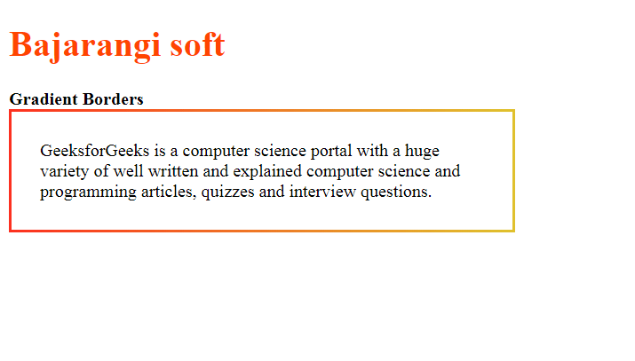
<!DOCTYPE html>
<html>
<head>
    <title>Gradient Borders</title>

    <style>
        .border {
            width: 400px;
            border: 3px solid transparent;
            border-image: linear-gradient(to right, #fc311e, #e0c12d);
            border-image-slice: 1;
            padding: 25px;
        }
    </style>
</head>
<body>
<h1 style="color: orangered">Bajarangi soft</h1>

<b>Gradient Borders</b>

<div class="border">
    GeeksforGeeks is a computer science portal with a huge
    variety of well written and explained computer science
    and programming articles, quizzes and interview questions.
</div>
</body>
</html>
.border {
width: 400px;
position: relative;
background: linear-gradient(to right, green, lightgreen);
padding: 3px;
}
.inner {
background: white;
padding: 25px;
}
<!DOCTYPE html>
<html>

<head>
    <title>Gradient Borders</title>

    <style>
        .border {
            width: 400px;
            position: relative;
            background: linear-gradient(to right, #dc50d5, #dc1c16);
            padding: 3px;
        }
        .inner {
            background: white;
            padding: 25px;
        }
    </style>
</head>

<body>
<h1 style="color: darkred">
   Bajarangi Soft
</h1>

<b>Gradient Borders</b>

<div class="border">
    <div class="inner">
        GeeksforGeeks is a computer science portal with
        a huge variety of well written and explained
        computer science and programming articles,
        quizzes and interview questions.
    </div>
</div>
</body>

</html>