
 Posted By
Bajarangi soft ,
Posted On 27-11-2020
Posted By
Bajarangi soft ,
Posted On 27-11-2020
Step 1:Create index.html and implement below coder in it.
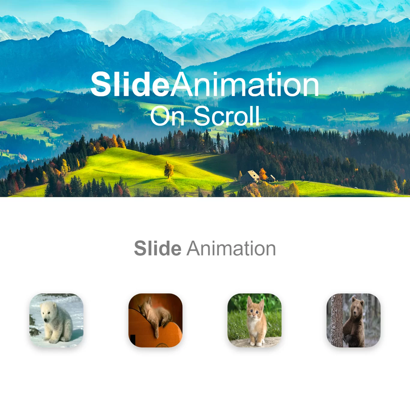
<section>
    <h1><b>Slide</b> Animation</h1>
    <div class="box" data-animation="slideInRight">
        <img class="image" src="https://cdn.hipwallpaper.com/i/64/61/4VnrQO.jpg" alt="doll"/>
    </div>
    <div class="box" data-animation="slideInUp" data-animation-delay="300ms">
        <img class="image" src="https://cdn.hipwallpaper.com/i/12/0/R70NSb.jpg" alt="doll"/>
    </div>
    <div class="box" data-animation="slideInDown" data-animation-delay="600ms">
        <img class="image" src="https://cdn.hipwallpaper.com/i/15/37/AargFU.jpg" alt="doll"/>
    </div>
    <div class="box" data-animation="slideInLeft" data-animation-delay="900ms">
        <img class="image" src="https://cdn.hipwallpaper.com/i/30/5/mNiI78.jpg" alt="doll"/>
    </div>
</section>
<style>
    @-webkit-keyframes slideInUp {
        0% {
            opacity: 0;
            -webkit-transform: translateY(50%);
            transform: translateY(50%);
        }
        100% {
            opacity: 1;
            -webkit-transform: none;
            transform: none;
        }
    }
    @keyframes slideInUp {
        0% {
            opacity: 0;
            -webkit-transform: translateY(50%);
            transform: translateY(50%);
        }
        100% {
            opacity: 1;
            -webkit-transform: none;
            transform: none;
        }
    }
    @-webkit-keyframes slideInDown {
        0% {
            opacity: 0;
            -webkit-transform: translateY(-50%);
            transform: translateY(-50%);
        }
        100% {
            opacity: 1;
            -webkit-transform: none;
            transform: none;
        }
    }
    @keyframes slideInDown {
        0% {
            opacity: 0;
            -webkit-transform: translateY(-50%);
            transform: translateY(-50%);
        }
        100% {
            opacity: 1;
            -webkit-transform: none;
            transform: none;
        }
    }
    @-webkit-keyframes slideInleft {
        0% {
            opacity: 0;
            -webkit-transform: translateX(50%);
            transform: translateX(50%);
        }
        100% {
            opacity: 1;
            -webkit-transform: none;
            transform: none;
        }
    }
    @keyframes slideInleft {
        0% {
            opacity: 0;
            -webkit-transform: translateX(50%);
            transform: translateX(50%);
        }
        100% {
            opacity: 1;
            -webkit-transform: none;
            transform: none;
        }
    }
    @-webkit-keyframes slideInRight {
        0% {
            opacity: 0;
            -webkit-transform: translateX(-50%);
            transform: translateX(-50%);
        }
        100% {
            opacity: 1;
            -webkit-transform: none;
            transform: none;
        }
    }
    @keyframes slideInRight {
        0% {
            opacity: 0;
            -webkit-transform: translateX(-50%);
            transform: translateX(-50%);
        }
        100% {
            opacity: 1;
            -webkit-transform: none;
            transform: none;
        }
    }
    @-webkit-keyframes fadeIn {
        0% {
            opacity: 0;
        }
        100% {
            opacity: 1;
        }
    }
    @keyframes fadeIn {
        0% {
            opacity: 0;
        }
        100% {
            opacity: 1;
        }
    }


    @-webkit-keyframes flipInY {
        0% {
            opacity: 0;
            -webkit-transform: rotateY(90deg);
            transform: rotateY(90deg);
        }
        100% {
            opacity: 1;
            -webkit-transform: none;
            transform: none;
        }
    }
    @keyframes flipInY {
        0% {
            opacity: 0;
            -webkit-transform: rotateY(90deg);
            transform: rotateY(90deg);
        }
        100% {
            opacity: 1;
            -webkit-transform: none;
            transform: none;
        }
    }
    [data-animation] {
        opacity: 0;
        -webkit-animation-timing-function: cubic-bezier(0.4, 0, 0.2, 1);
        animation-timing-function: cubic-bezier(0.4, 0, 0.2, 1);
        -webkit-animation-fill-mode: both;
        animation-fill-mode: both;
        -webkit-animation-duration: 1s;
        animation-duration: 1s;
    }

    .animations-disabled, .animations-disabled [data-animation] {
        -webkit-animation: none !important;
        animation: none !important;
        opacity: 1 !important;
    }

    .slideInUp {
        -webkit-animation-name: slideInUp;
        animation-name: slideInUp;
    }

    .slideInDown {
        -webkit-animation-name: slideInDown;
        animation-name: slideInDown;
    }

    .slideInLeft {
        -webkit-animation-name: slideInleft;
        animation-name: slideInleft;
    }

    .slideInRight {
        -webkit-animation-name: slideInRight;
        animation-name: slideInRight;
    }

    .fadeIn {
        -webkit-animation-name: fadeIn;
        animation-name: fadeIn;
    }

    .fadeOut {
        -webkit-animation-name: fadeIn;
        animation-name: fadeIn;
        animation-direction: reverse;
    }


    .flipInY {
        -webkit-animation-name: flipInY;
        animation-name: flipInY;
    }

    .flipOutY {
        -webkit-animation-name: flipInY;
        animation-name: flipInY;
        animation-direction: reverse;
    }

    * { box-sizing: border-box; line-height: calc(1em + 0.25rem); }
    html { font: 18px/1.5 'Nunito', sans-serif; }
    body { margin: 0; min-height: 100vh; overflow-x: hidden; color: rgba(0,0,0,.5); font-weight: 300; }
    h1 { width: 100%; font-weight: 300; text-align: center; margin: 0 0 4rem; font-size: 3rem; }
    b { font-weight: 700; }
    header, section {
        display: flex;
        flex-wrap: wrap;
        width: 100vw;
        height: 100vh;
        justify-content: space-around;
        align-items: center;
        align-content: center;
        padding: 3rem 1rem;
    }
    header {
    background: url("https://cdn.hipwallpaper.com/i/99/12/SYepgx.jpg");
        background-repeat: no-repeat;
        background-attachment: fixed;
        background-size: cover;
    }
    header h1 { margin: 0; color: #fff; }
    header .title { font-size: 5rem; }
    header .subtitle { font-size: 4rem; }
    section:nth-child(odd) { background: whitesmoke; }
    .image{
        width: 8rem;
        height: 8rem;
        margin: 1rem;
        border-radius: 2rem;
        box-shadow: 0 6px 18px rgba(0,0,0,0.25);
    }
</style>
<script>
    var Animation = function({ offset } = { offset: 10 }) {
        var _elements;

        // Define variables
        var windowTop = offset * window.innerHeight / 100;
        var windowBottom = window.innerHeight - windowTop;
        var windowLeft = 0;
        var windowRight = window.innerWidth;

        function start(element) {
            // Set the attributes to customize
            element.style.animationDelay = element.dataset.animationDelay;
            element.style.animationDuration = element.dataset.animationDuration;
            //set classes to animated
            element.classList.add(element.dataset.animation);
            // Set element to animated
            element.dataset.animated = "true";
        }

        function isElementOnScreen(element) {
            var elementRect = element.getBoundingClientRect();
            var elementTop =
                elementRect.top + parseInt(element.dataset.animationOffset) ||
                elementRect.top;
            var elementBottom =
                elementRect.bottom - parseInt(element.dataset.animationOffset) ||
                elementRect.bottom;
            var elementLeft = elementRect.left;
            var elementRight = elementRect.right;

            return (
                elementTop <= windowBottom &&
                elementBottom >= windowTop &&
                elementLeft <= windowRight &&
                elementRight >= windowLeft
            );
        }


        function checkElementsOnScreen(els = _elements) {
            for (var i = 0, len = els.length; i < len; i++) {
                if (els[i].dataset.animated) continue;

                isElementOnScreen(els[i]) && start(els[i]);
            }
        }


        function update() {
            _elements = document.querySelectorAll(
                "[data-animation]:not([data-animated])"
            );
            checkElementsOnScreen(_elements);
        }


        window.addEventListener("load", update, false);
        window.addEventListener("scroll", () => checkElementsOnScreen(_elements), { passive: true });
        window.addEventListener("resize", () => checkElementsOnScreen(_elements), false);

        return {
            start,
            isElementOnScreen,
            update
        };
    };

    // Initialize
    var options = {
        offset: 20 //percentage of window
    };
    var animation = new Animation(options);
</script>
<!DOCTYPE html>
<html>
<head>
    <title>How Can I Create Slide Animation On Scroll Using CSS</title>
    <meta name="viewport" content="width=device-width, initial-scale=1.0">
    <link rel="stylesheet" href="https://maxcdn.bootstrapcdn.com/bootstrap/3.3.6/css/bootstrap.min.css"/>
    <link rel="stylesheet" href="https://fonts.googleapis.com/css?family=Nunito:300,700"/>
    <script src="https://cdnjs.cloudflare.com/ajax/libs/jquery/3.4.1/jquery.min.js"></script>

</head>
<style>
    @-webkit-keyframes slideInUp {
        0% {
            opacity: 0;
            -webkit-transform: translateY(50%);
            transform: translateY(50%);
        }
        100% {
            opacity: 1;
            -webkit-transform: none;
            transform: none;
        }
    }
    @keyframes slideInUp {
        0% {
            opacity: 0;
            -webkit-transform: translateY(50%);
            transform: translateY(50%);
        }
        100% {
            opacity: 1;
            -webkit-transform: none;
            transform: none;
        }
    }
    @-webkit-keyframes slideInDown {
        0% {
            opacity: 0;
            -webkit-transform: translateY(-50%);
            transform: translateY(-50%);
        }
        100% {
            opacity: 1;
            -webkit-transform: none;
            transform: none;
        }
    }
    @keyframes slideInDown {
        0% {
            opacity: 0;
            -webkit-transform: translateY(-50%);
            transform: translateY(-50%);
        }
        100% {
            opacity: 1;
            -webkit-transform: none;
            transform: none;
        }
    }
    @-webkit-keyframes slideInleft {
        0% {
            opacity: 0;
            -webkit-transform: translateX(50%);
            transform: translateX(50%);
        }
        100% {
            opacity: 1;
            -webkit-transform: none;
            transform: none;
        }
    }
    @keyframes slideInleft {
        0% {
            opacity: 0;
            -webkit-transform: translateX(50%);
            transform: translateX(50%);
        }
        100% {
            opacity: 1;
            -webkit-transform: none;
            transform: none;
        }
    }
    @-webkit-keyframes slideInRight {
        0% {
            opacity: 0;
            -webkit-transform: translateX(-50%);
            transform: translateX(-50%);
        }
        100% {
            opacity: 1;
            -webkit-transform: none;
            transform: none;
        }
    }
    @keyframes slideInRight {
        0% {
            opacity: 0;
            -webkit-transform: translateX(-50%);
            transform: translateX(-50%);
        }
        100% {
            opacity: 1;
            -webkit-transform: none;
            transform: none;
        }
    }
    @-webkit-keyframes fadeIn {
        0% {
            opacity: 0;
        }
        100% {
            opacity: 1;
        }
    }
    @keyframes fadeIn {
        0% {
            opacity: 0;
        }
        100% {
            opacity: 1;
        }
    }


    @-webkit-keyframes flipInY {
        0% {
            opacity: 0;
            -webkit-transform: rotateY(90deg);
            transform: rotateY(90deg);
        }
        100% {
            opacity: 1;
            -webkit-transform: none;
            transform: none;
        }
    }
    @keyframes flipInY {
        0% {
            opacity: 0;
            -webkit-transform: rotateY(90deg);
            transform: rotateY(90deg);
        }
        100% {
            opacity: 1;
            -webkit-transform: none;
            transform: none;
        }
    }
    [data-animation] {
        opacity: 0;
        -webkit-animation-timing-function: cubic-bezier(0.4, 0, 0.2, 1);
        animation-timing-function: cubic-bezier(0.4, 0, 0.2, 1);
        -webkit-animation-fill-mode: both;
        animation-fill-mode: both;
        -webkit-animation-duration: 1s;
        animation-duration: 1s;
    }

    .animations-disabled, .animations-disabled [data-animation] {
        -webkit-animation: none !important;
        animation: none !important;
        opacity: 1 !important;
    }

    .slideInUp {
        -webkit-animation-name: slideInUp;
        animation-name: slideInUp;
    }

    .slideInDown {
        -webkit-animation-name: slideInDown;
        animation-name: slideInDown;
    }

    .slideInLeft {
        -webkit-animation-name: slideInleft;
        animation-name: slideInleft;
    }

    .slideInRight {
        -webkit-animation-name: slideInRight;
        animation-name: slideInRight;
    }

    .fadeIn {
        -webkit-animation-name: fadeIn;
        animation-name: fadeIn;
    }

    .fadeOut {
        -webkit-animation-name: fadeIn;
        animation-name: fadeIn;
        animation-direction: reverse;
    }


    .flipInY {
        -webkit-animation-name: flipInY;
        animation-name: flipInY;
    }

    .flipOutY {
        -webkit-animation-name: flipInY;
        animation-name: flipInY;
        animation-direction: reverse;
    }

    * { box-sizing: border-box; line-height: calc(1em + 0.25rem); }
    html { font: 18px/1.5 'Nunito', sans-serif; }
    body { margin: 0; min-height: 100vh; overflow-x: hidden; color: rgba(0,0,0,.5); font-weight: 300; }
    h1 { width: 100%; font-weight: 300; text-align: center; margin: 0 0 4rem; font-size: 3rem; }
    b { font-weight: 700; }
    header, section {
        display: flex;
        flex-wrap: wrap;
        width: 100vw;
        height: 100vh;
        justify-content: space-around;
        align-items: center;
        align-content: center;
        padding: 3rem 1rem;
    }
    header {
    background: url("https://cdn.hipwallpaper.com/i/99/12/SYepgx.jpg");
        background-repeat: no-repeat;
        background-attachment: fixed;
        background-size: cover;
    }
    header h1 { margin: 0; color: #fff; }
    header .title { font-size: 5rem; }
    header .subtitle { font-size: 4rem; }
    section:nth-child(odd) { background: whitesmoke; }
    .image{
        width: 8rem;
        height: 8rem;
        margin: 1rem;
        border-radius: 2rem;
        box-shadow: 0 6px 18px rgba(0,0,0,0.25);
    }
</style>
<body>
<header class="hero" data-animation="fadeIn">
    <h1>
        <div class="title" data-animation="slideInUp" data-animation-delay="600ms"><b>Animate</b></div>
        <div class="subtitle" data-animation="slideInUp" data-animation-delay="1000ms">On Scroll</div>
    </h1>
</header>

<section>
    <h1><b>Slide</b> Animation</h1>
    <div class="box" data-animation="slideInRight">
        <img class="image" src="https://cdn.hipwallpaper.com/i/64/61/4VnrQO.jpg" alt="doll"/>
    </div>
    <div class="box" data-animation="slideInUp" data-animation-delay="300ms">
        <img class="image" src="https://cdn.hipwallpaper.com/i/12/0/R70NSb.jpg" alt="doll"/>
    </div>
    <div class="box" data-animation="slideInDown" data-animation-delay="600ms">
        <img class="image" src="https://cdn.hipwallpaper.com/i/15/37/AargFU.jpg" alt="doll"/>
    </div>
    <div class="box" data-animation="slideInLeft" data-animation-delay="900ms">
        <img class="image" src="https://cdn.hipwallpaper.com/i/30/5/mNiI78.jpg" alt="doll"/>
    </div>
</section>
</body>
<script>
    var Animation = function({ offset } = { offset: 10 }) {
        var _elements;

        // Define variables
        var windowTop = offset * window.innerHeight / 100;
        var windowBottom = window.innerHeight - windowTop;
        var windowLeft = 0;
        var windowRight = window.innerWidth;

        function start(element) {
            // Set the attributes to customize
            element.style.animationDelay = element.dataset.animationDelay;
            element.style.animationDuration = element.dataset.animationDuration;
            //set classes to animated
            element.classList.add(element.dataset.animation);
            // Set element to animated
            element.dataset.animated = "true";
        }

        function isElementOnScreen(element) {
            var elementRect = element.getBoundingClientRect();
            var elementTop =
                elementRect.top + parseInt(element.dataset.animationOffset) ||
                elementRect.top;
            var elementBottom =
                elementRect.bottom - parseInt(element.dataset.animationOffset) ||
                elementRect.bottom;
            var elementLeft = elementRect.left;
            var elementRight = elementRect.right;

            return (
                elementTop <= windowBottom &&
                elementBottom >= windowTop &&
                elementLeft <= windowRight &&
                elementRight >= windowLeft
            );
        }


        function checkElementsOnScreen(els = _elements) {
            for (var i = 0, len = els.length; i < len; i++) {
                if (els[i].dataset.animated) continue;

                isElementOnScreen(els[i]) && start(els[i]);
            }
        }


        function update() {
            _elements = document.querySelectorAll(
                "[data-animation]:not([data-animated])"
            );
            checkElementsOnScreen(_elements);
        }


        window.addEventListener("load", update, false);
        window.addEventListener("scroll", () => checkElementsOnScreen(_elements), { passive: true });
        window.addEventListener("resize", () => checkElementsOnScreen(_elements), false);

        return {
            start,
            isElementOnScreen,
            update
        };
    };

    // Initialize
    var options = {
        offset: 20 //percentage of window
    };
    var animation = new Animation(options);
</script>
</html>