
 Posted By
Bajarangi soft ,
Posted On 13-10-2020
Posted By
Bajarangi soft ,
Posted On 13-10-2020
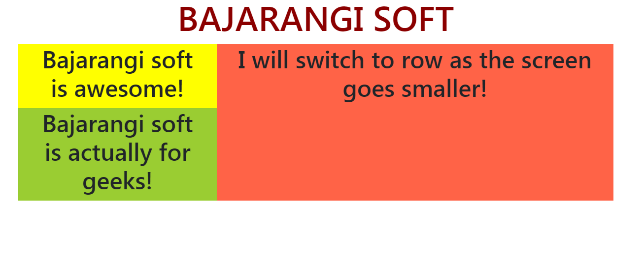
The task is to switch a column of Bootstrap 4 grid layout to row on small screen sizes.
Syntax:
<element class="col-md-4 col-sm-6 ...">...</element>
<html>

<head>
    <link href=
                  "https://stackpath.bootstrapcdn.com/bootstrap/4.3.1/css/bootstrap.min.css"
          rel="stylesheet">
</head>

<body>
<center>
    <h1 style="color: darkred;">BAJARANGI SOFT</h1>
    <div class="row">
        <div class="col-md-4 col-sm-6"
             style="background-color: #dcad21;">
            <br>
        </div>
        <div class="col-md-4 col-sm-6"
             style="background-color: black;">
            <br>
        </div>
        <!-- Sum of SM col exceeds 12 so if the screen
            is small (less than 576px) the last column
            will Automatically get aligned in the next row -->
        <div class="col-md-4 col-sm-6"
             style="background-color: rebeccapurple;">
            <br>
        </div>
    </div>
</center>
</body>

</html>
<!DOCTYPE html>
<html>

<head>
    <link href=
                  "https://stackpath.bootstrapcdn.com/bootstrap/4.3.1/css/bootstrap.min.css"
          rel="stylesheet">
</head>
<body>
<center>
    <h1 style="color: darkred;">BAJARANGI SOFT</h1>
    <div class="row container">
        <div class="col-md-4 col-sm-12">

            <!-- Nested! switch to row as screen gets smaller -->
            <div class="row">
                <div class="col-md-12 col-sm-6"
                     style="background-color: yellow;">
                    <h3>Bajarangi soft is awesome!</h3>
                </div>
                <div class="col-md-12 col-sm-6"
                     style="background-color: yellowgreen;">
                    <h3>Bajarangi soft is actually for geeks!</h3>
                </div>
            </div>
        </div>
        <div class="col-md-8 col-sm-12"
             style="background-color: tomato;">
            <h3>I will switch to row as the screen goes smaller!</h3>
        </div>
    </div>
</center>
</body>
</html>