
 Posted By
Bajarangi soft ,
Posted On 01-10-2020
Posted By
Bajarangi soft ,
Posted On 01-10-2020
1.CARD column,sizes Example-1
<!DOCTYPE html>
<html lang="en">
<head>
<title>Bootstrap Example</title>
<meta charset="utf-8">
<meta name="viewport" content="width=device-width, initial-scale=1">
<link rel="stylesheet" href="https://maxcdn.bootstrapcdn.com/bootstrap/4.5.2/css/bootstrap.min.css">
<script src="https://ajax.googleapis.com/ajax/libs/jquery/3.5.1/jquery.min.js"></script>
<script src="https://cdnjs.cloudflare.com/ajax/libs/popper.js/1.16.0/umd/popper.min.js"></script>
<script src="https://maxcdn.bootstrapcdn.com/bootstrap/4.5.2/js/bootstrap.min.js"></script>
</head>
<body>
<div class="container">
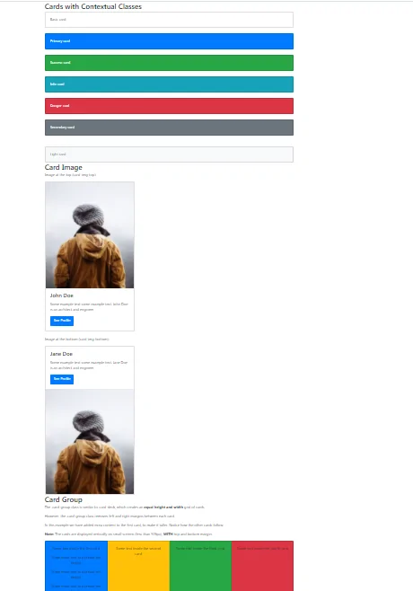
<h2>Cards with Contextual Classes</h2>
<div class="card">
<div class="card-body">Basic card</div>
</div>
<br>
<div class="card bg-primary text-white">
<div class="card-body">Primary card</div>
</div>
<br>
<div class="card bg-success text-white">
<div class="card-body">Success card</div>
</div>
<br>
<div class="card bg-info text-white">
<div class="card-body">Info card</div>
</div>
<br>
<div class="card bg-danger text-white">
<div class="card-body">Danger card</div>
</div>
<br>
<div class="card bg-secondary text-white">
<div class="card-body">Secondary card</div>
</div>
<br>
<br>
<div class="card bg-light text-dark">
<div class="card-body">Light card</div>
</div>
</div>
</body>
</html>
<!DOCTYPE html>
<html lang="en">
<head>
    <title>Bootstrap Example</title>
    <meta charset="utf-8">
    <meta name="viewport" content="width=device-width, initial-scale=1">
    <link rel="stylesheet" href="https://maxcdn.bootstrapcdn.com/bootstrap/4.5.2/css/bootstrap.min.css">
    <script src="https://ajax.googleapis.com/ajax/libs/jquery/3.5.1/jquery.min.js"></script>
    <script src="https://cdnjs.cloudflare.com/ajax/libs/popper.js/1.16.0/umd/popper.min.js"></script>
    <script src="https://maxcdn.bootstrapcdn.com/bootstrap/4.5.2/js/bootstrap.min.js"></script>
</head>
<body>

<div class="container">
    <h2>Card Image</h2>
    <p>Image at the top (card-img-top):</p>
    <div class="card" style="width:400px">
        <img class="card-img-top" src="my_pic.jpg" alt="Card image" style="width:100%">
        <div class="card-body">
            <h4 class="card-title">John Doe</h4>
            <p class="card-text">Some example text some example text. John Doe is an architect and engineer</p>
            <a href="#" class="btn btn-primary">See Profile</a>
        </div>
    </div>
    <br>

    <p>Image at the bottom (card-img-bottom):</p>
    <div class="card" style="width:400px">
        <div class="card-body">
            <h4 class="card-title">Jane Doe</h4>
            <p class="card-text">Some example text some example text. Jane Doe is an architect and engineer</p>
            <a href="#" class="btn btn-primary">See Profile</a>
        </div>
        <img class="card-img-bottom" src="my_pic.jpg" alt="Card image" style="width:100%">
    </div>
</div>

</body>
</html>
<!DOCTYPE html>
<html lang="en">
<head>
    <title>Bootstrap Card</title>
    <meta charset="utf-8">
    <meta name="viewport" content="width=device-width, initial-scale=1">
    <link rel="stylesheet" href="https://maxcdn.bootstrapcdn.com/bootstrap/4.5.2/css/bootstrap.min.css">
    <script src="https://ajax.googleapis.com/ajax/libs/jquery/3.5.1/jquery.min.js"></script>
    <script src="https://cdnjs.cloudflare.com/ajax/libs/popper.js/1.16.0/umd/popper.min.js"></script>
    <script src="https://maxcdn.bootstrapcdn.com/bootstrap/4.5.2/js/bootstrap.min.js"></script>
</head>
<body>

<div class="container">
    <h2>Card Group</h2>
    <p>The .card-group class is similar to .card-deck, which creates an <strong>equal height and width</strong> grid of cards.</p>
    <p>However, the .card-group class removes left and right margins between each card.</p>
    <p>In this example we have added extra content to the first card, to make it taller. Notice how the other cards follow.</p>
    <p><strong>Note:</strong> The cards are displayed vertically on small screens (less than 576px), <strong>WITH</strong> top and bottom margin:</p>
    <div class="card-group">
        <div class="card bg-primary">
            <div class="card-body text-center">
                <p class="card-text">Some text inside the first card</p>
                <p class="card-text">Some more text to increase the height</p>
                <p class="card-text">Some more text to increase the height</p>
                <p class="card-text">Some more text to increase the height</p>
            </div>
        </div>
        <div class="card bg-warning">
            <div class="card-body text-center">
                <p class="card-text">Some text inside the second card</p>
            </div>
        </div>
        <div class="card bg-success">
            <div class="card-body text-center">
                <p class="card-text">Some text inside the third card</p>
            </div>
        </div>
        <div class="card bg-danger">
            <div class="card-body text-center">
                <p class="card-text">Some text inside the fourth card</p>
            </div>
        </div>
    </div>
</div>

</body>
</html>