
 Posted By
Bajarangi soft ,
Posted On 06-10-2020
Posted By
Bajarangi soft ,
Posted On 06-10-2020
Create A Mobile Navigation Menu
Step 1: Create index.html and implement below code
<!-- Simulate a smartphone / tablet -->
<div class="mobile-container">
<!-- Top Navigation Menu -->
<div class="topnav">
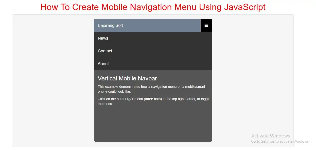
<a href="#home" class="active">BajarangiSoft</a>
<div id="myLinks">
<a href="#news">News</a>
<a href="#contact">Contact</a>
<a href="#about">About</a>
</div>
<a href="javascript:void(0);" class="icon" onclick="myFunction()">
<i class="fa fa-bars"></i>
</a>
</div>
<div style="padding-left:16px">
<h3>Vertical Mobile Navbar</h3>
<p>This example demonstrates how a navigation menu on a mobile/smart phone could look like.</p>
<p>Click on the hamburger menu (three bars) in the top right corner, to toggle the menu.</p>
</div>
<!-- End smartphone / tablet look -->
</div>
Step 2: Now implement CSS code to display menu bar.
<style>
    h1{
        color:red;
    }
    body {
        font-family: Arial, Helvetica, sans-serif;
    }

    .mobile-container {
        max-width: 480px;
        margin: auto;
        background-color: #555;
        height: 500px;
        color: white;
        border-radius: 10px;
    }

    .topnav {
        overflow: hidden;
        background-color: #333;
        position: relative;
    }

    .topnav #myLinks {
        display: none;
    }

    .topnav a {
        color: white;
        padding: 14px 16px;
        text-decoration: none;
        font-size: 17px;
        display: block;
    }

    .topnav a.icon {
        background: black;
        display: block;
        position: absolute;
        right: 0;
        top: 0;
    }

    .topnav a:hover {
        background-color: #ddd;
        color: black;
    }

    .active {
        background-color: slategray;
        color: white;
    }
</style>
Step 3: Now Implement java script to open menu bar.
<script>
    function myFunction() {
        var x = document.getElementById("myLinks");
        if (x.style.display === "block") {
            x.style.display = "none";
        } else {
            x.style.display = "block";
        }
    }
</script>
<!DOCTYPE html>
<html>
<head>
    <title>How To Create Mobile Navigation Menu Using JavaScript</title>
    <meta charset="utf-8">
    <meta name="viewport" content="width=device-width, initial-scale=1">
    <link rel="stylesheet" href="https://maxcdn.bootstrapcdn.com/bootstrap/3.4.1/css/bootstrap.min.css">
    <link rel="stylesheet" href="https://cdnjs.cloudflare.com/ajax/libs/font-awesome/4.7.0/css/font-awesome.min.css">
</head>
<style>
    h1 {
        color: red;
    }

    body {
        font-family: Arial, Helvetica, sans-serif;
    }

    .mobile-container {
        max-width: 480px;
        margin: auto;
        background-color: #555;
        height: 500px;
        color: white;
        border-radius: 10px;
    }

    .topnav {
        overflow: hidden;
        background-color: #333;
        position: relative;
    }

    .topnav #myLinks {
        display: none;
    }

    .topnav a {
        color: white;
        padding: 14px 16px;
        text-decoration: none;
        font-size: 17px;
        display: block;
    }

    .topnav a.icon {
        background: black;
        display: block;
        position: absolute;
        right: 0;
        top: 0;
    }

    .topnav a:hover {
        background-color: #ddd;
        color: black;
    }

    .active {
        background-color: slategray;
        color: white;
    }
</style>
<body>
<div class="container">
    <br>
    <br>
    <br>
    <div class="text-center">
        <h1>How To Create Mobile Navigation Menu Using JavaScript</h1>
    </div>
    <div class="well">
        <!-- Simulate a smartphone / tablet -->
        <div class="mobile-container">
            <!-- Top Navigation Menu -->
            <div class="topnav">
                <a href="#home" class="active">BajarangiSoft</a>
                <div id="myLinks">
                    <a href="#news">News</a>
                    <a href="#contact">Contact</a>
                    <a href="#about">About</a>
                </div>
                <a href="javascript:void(0);" class="icon" onclick="myFunction()">
                    <i class="fa fa-bars"></i>
                </a>
            </div>
            <div style="padding-left:16px">
                <h3>Vertical Mobile Navbar</h3>
                <p>This example demonstrates how a navigation menu on a mobile/smart phone could look like.</p>
                <p>Click on the hamburger menu (three bars) in the top right corner, to toggle the menu.</p>
            </div>
            <!-- End smartphone / tablet look -->
        </div>
    </div>
    <div>
</body>
</html>
<script>
    function myFunction() {
        var x = document.getElementById("myLinks");
        if (x.style.display === "block") {
            x.style.display = "none";
        } else {
            x.style.display = "block";
        }
    }
</script>