
 Posted By
Bajarangi soft ,
Posted On 05-11-2020
Posted By
Bajarangi soft ,
Posted On 05-11-2020
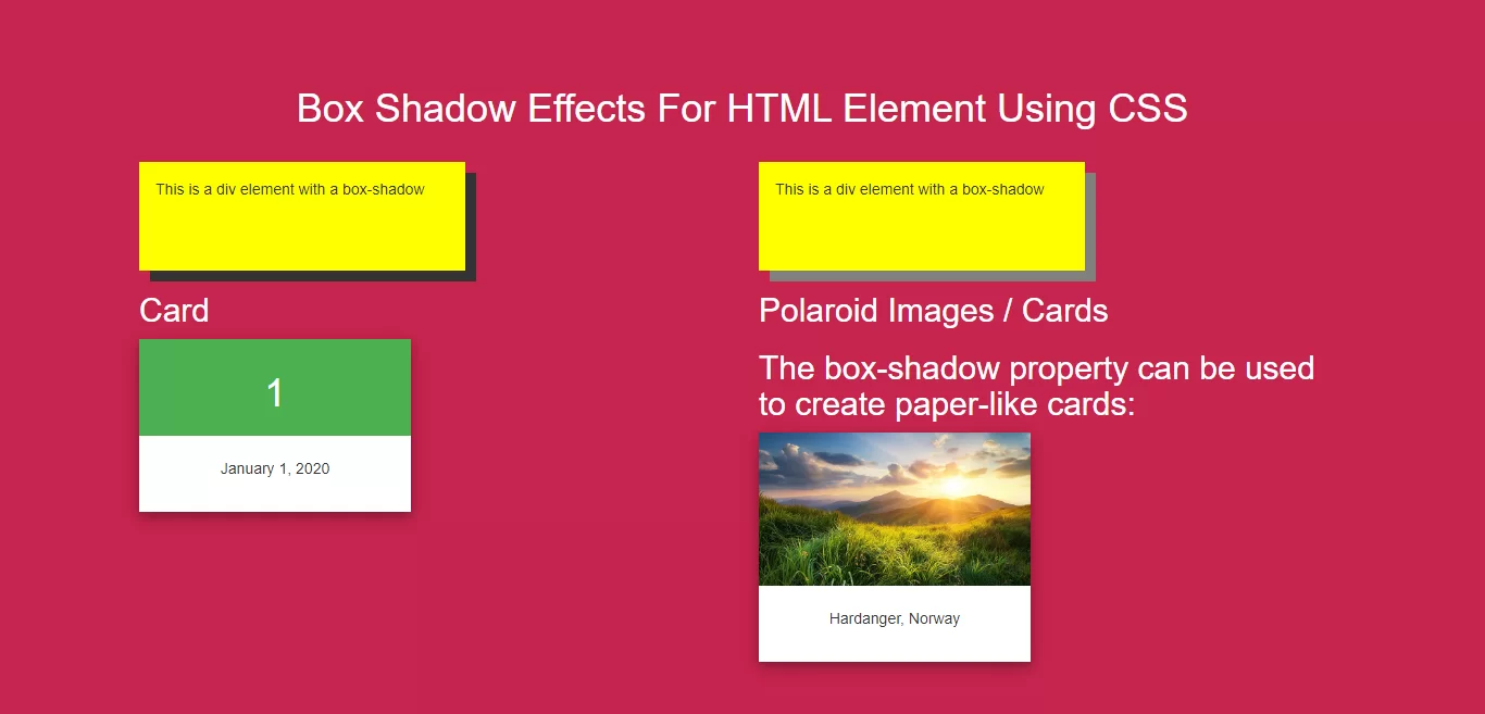
Complete Code For Setting Box Shadow Effects For HTML Element Using CSS.
<!DOCTYPE html>
<html>
<head>
    <title>How To Set Box Shadow Effects For HTML Element Using CSS</title>
    <meta name="viewport" content="width=device-width, initial-scale=1.0">
    <link rel="stylesheet" href="https://maxcdn.bootstrapcdn.com/bootstrap/3.3.6/css/bootstrap.min.css"/>

</head>
<style>
    body {
        background: #c7254e;
    }
 .div1{
     width: 300px;
     height: 100px;
     padding: 15px;
     background-color: yellow;
     box-shadow: 10px 10px;
 }
 .div2{
     width: 300px;
     height: 100px;
     padding: 15px;
     background-color: yellow;
     box-shadow: 10px 10px grey;
 }
    h2{
        color: white;
    }
    .card {
        width: 250px;
        box-shadow: 0 4px 8px 0 rgba(0, 0, 0, 0.2), 0 6px 20px 0 rgba(0, 0, 0, 0.19);
        text-align: center;
        background: white;
    }

    .header {
        background-color: #4CAF50;
        color: white;
        padding: 10px;
        font-size: 40px;
    }
.bg_color{
    padding: 20px;
}
    .polaroid {
        width: 250px;
        box-shadow: 0 4px 8px 0 rgba(0, 0, 0, 0.2), 0 6px 20px 0 rgba(0, 0, 0, 0.19);
        text-align: center;
        background: white;
    }


</style>
<body>
<br/><br/>
<div class="container">
    <br>
    <div class="text-center">
        <h1 id="color" style="color: white;"> Box Shadow Effects For HTML Element Using CSS</h1>
    </div>
    <br>
    <div >
       <div class="col-md-6">
           <div class="div1">This is a div element with a box-shadow</div>
       </div>
       <div class="col-md-6">
           <div class="div2">This is a div element with a box-shadow</div>
       </div>
       <div class="col-md-6">
           <h2>Card</h2>
           <div class="card">

               <div class="header">
                   <h1>1</h1>
               </div>

               <div class="bg_color">
                   <p>January 1, 2020</p>
               </div>
           </div>
       </div>
       <div class="col-md-6">
           <h2>Polaroid Images / Cards</h2>

           <h2>The box-shadow property can be used to create paper-like cards:</h2>

           <div class="polaroid">
               <img src="../image/demo6.jpg" alt="Norway" style="width:100%">
               <div class="bg_color">
                   <p>Hardanger, Norway</p>
               </div>
           </div>
       </div>

    </div>
</div>
</body>
</html>