
 Posted By
Bajarangi soft ,
Posted On 06-11-2020
Posted By
Bajarangi soft ,
Posted On 06-11-2020
Using CSS you can hide and show the back face of two rotated <div> elements.
<style>
    body {
        background: #c7254e;
    }


    #div1 {
        position: relative;
        height: 200px;
        width: 400px;
        background-color: #b3b300;
        transform: rotateY(180deg);
        -webkit-backface-visibility: hidden; /* Safari */
        backface-visibility: hidden;
    }

    #div2 {
        position: relative;
        height: 200px;
        width: 400px;
        background-color: #b3b300;
        transform: rotateY(180deg);
        -webkit-backface-visibility: hidden; /* Safari */
        backface-visibility: visible;
    }
</style>
Complete Code For Using CSS Backface Visibility Property With HTML.
<!DOCTYPE html>
<html>
<head>
<title>How To Use CSS Backface Visibility Property With HTML</title>
<meta name="viewport" content="width=device-width, initial-scale=1.0">
<link rel="stylesheet" href="https://maxcdn.bootstrapcdn.com/bootstrap/3.3.6/css/bootstrap.min.css"/>
</head>
<style>
body {
background: #c7254e;
}
#div1 {
position: relative;
height: 200px;
width: 400px;
background-color: #b3b300;
transform: rotateY(180deg);
-webkit-backface-visibility: hidden; /* Safari */
backface-visibility: hidden;
}
#div2 {
position: relative;
height: 200px;
width: 400px;
background-color: #b3b300;
transform: rotateY(180deg);
-webkit-backface-visibility: hidden; /* Safari */
backface-visibility: visible;
}
</style>
<body>
<br/><br/>
<div class="container">
<br>
<div class="text-center">
<h1 id="color" style="color: white;">CSS Backface Visibility Property With HTML</h1>
</div>
<br>
<div class="col-md-12">
<div class="well">
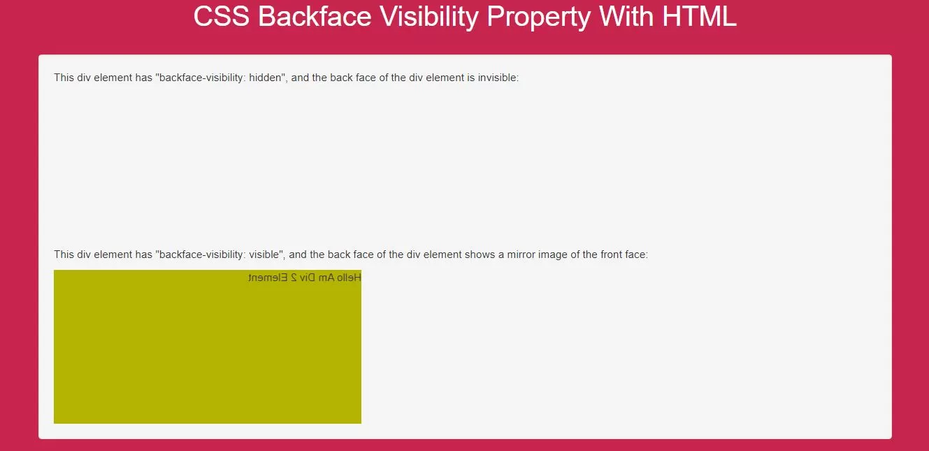
<p>This div element has "backface-visibility: hidden", and the back face of the div element is
invisible:</p>
<div id="div1">DIV 1</div>
<p>This div element has "backface-visibility: visible", and the back face of the div element shows a mirror
image of the front face:</p>
<div id="div2">Hello Am Div 2 Element</div>
</div>
</div>
</div>
</body>
</html>