
 Posted By
Bajarangi soft ,
Posted On 30-09-2020
Posted By
Bajarangi soft ,
Posted On 30-09-2020
The transform property applies a 2D or 3D transformation to an element. This property allows you to rotate, scale, move, skew, etc., elements.
Syntax and Usage
Return the transform property:
object.style.transform

Set the transform property:
object.style.transform = "none|transform-functions|initial|inherit"
Property Values
| Value | Description |
|---|---|
| none | Defines that there should be no transformation |
| matrix(n, n, n, n, n, n) | Defines a 2D transformation, using a matrix of six values |
| matrix3d(n, n, n, n, etc....) | Defines a 3D transformation, using a 4x4 matrix of 16 values |
| translate(x, y) | Defines a 2D translation |
| translate3d(x, y, z) | Defines a 3D translation |
| translateX(x) | Defines a translation, using only the value for the X-axis |
| translateY(y) | Defines a translation, using only the value for the Y-axis |
| translateZ(z) | Defines a 3D translation, using only the value for the Z-axis |
| scale(x, y) | Defines a 2D scale transformation |
| scale3d(x, y, z) | Defines a 3D scale transformation |
| scaleX(x) | Defines a scale transformation by giving a value for the X-axis |
| scaleY(y) | Defines a scale transformation by giving a value for the Y-axis |
| scaleZ(z) | Defines a 3D scale transformation by giving a value for the Z-axis |
| rotate(angle) | Defines a 2D rotation, the angle is specified in the parameter |
| rotate3d(x, y, z, angle) | Defines a 3D rotation |
| rotateX(angle) | Defines a 3D rotation along the X-axis |
| rotateY(angle) | Defines a 3D rotation along the Y-axis |
| rotateZ(angle) | Defines a 3D rotation along the Z-axis |
| skew(x-angle, y-angle) | Defines a 2D skew transformation along the X- and the Y-axis |
| skewX(angle) | Defines a 2D skew transformation along the X-axis |
| skewY(angle) | Defines a 2D skew transformation along the Y-axis |
| perspective(n) | Defines a perspective view for a 3D transformed element |
| initial | Sets this property to its default value. |
| inherit | Inherits this property from its parent element. |
Return Value: A String, representing the transform property of an element.
Example(1)
<style>
#DIV {
margin: auto;
border: 1px solid black;
width: 200px;
height: 100px;
background-color: darkseagreen;
color: white;
}
</style>
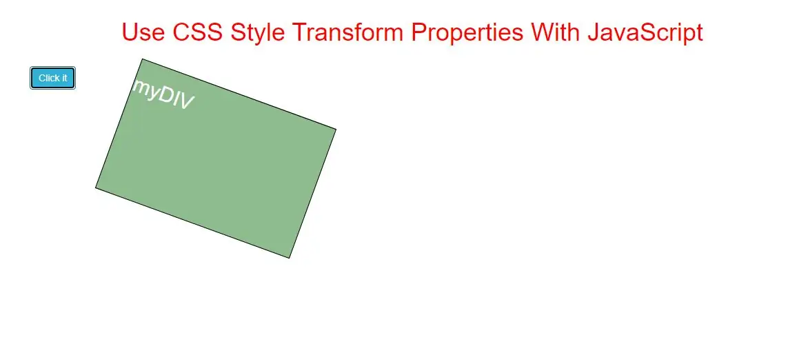
<button onclick="myFunction()">Click it</button>
<div id="DIV">
<h1>myDIV</h1>
</div>
<script>
function myFunction() {
// Code for IE9
document.getElementById("DIV").style.msTransform = "rotate(20deg)";
// Standard syntax
document.getElementById("DIV").style.transform = "rotate(20deg)";
}
</script>
In above example when you click button the div element rotate up to 20 degree.
Complete Code For CSS Style Transform Properties With JavaScript
<!DOCTYPE html>
<html>
<head>
    <title>Use CSS Style Transform Properties With JavaScript</title>
    <meta charset="utf-8">
    <meta name="viewport" content="width=device-width, initial-scale=1">
    <link rel="stylesheet" href="https://maxcdn.bootstrapcdn.com/bootstrap/3.4.1/css/bootstrap.min.css">
</head>
<style>
    h1 {
        color: red;

    }

    #DIV {
        margin: auto;
        border: 1px solid black;
        width: 300px;
        height: 200px;
        background-color: darkseagreen;
        color: white;
    }
</style>

<body>
<div class="container">
    <br>
    <div class="text-center">
        <h1>Use CSS Style Transform Properties With JavaScript</h1>
    </div>
    <br>

    <div class="col-md-6">
        <button class="btn btn-info" onclick="change()">Click it</button>
        <div id="DIV">
            <h2>myDIV</h2>
        </div>
    </div>

</body>
</html>
<script>
    function change() {
        // Code for IE9
        document.getElementById("DIV").style.msTransform = "rotate(20deg)";
        // Standard syntax
        document.getElementById("DIV").style.transform = "rotate(20deg)";
    }
</script>