
 Posted By
Bajarangi soft ,
Posted On 06-11-2020
Posted By
Bajarangi soft ,
Posted On 06-11-2020
The transition-timing-function property :
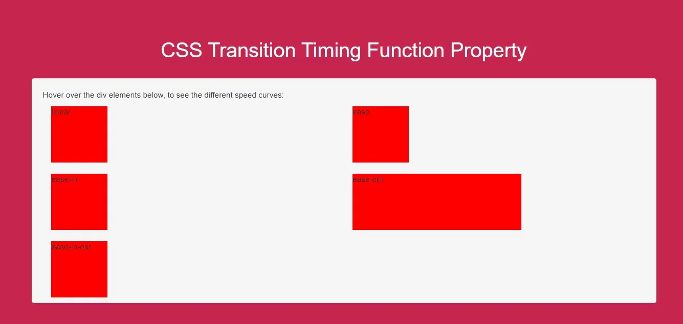
ease - specifies a transition effect with a slow start, then fast, then end slowly (this is default)linear - specifies a transition effect with the same speed from start to endease-in - specifies a transition effect with a slow startease-out - specifies a transition effect with a slow endease-in-out - specifies a transition effect with a slow start and endcubic-bezier(n,n,n,n) - lets you define your own values in a cubic-bezier function
Complete Code For Using CSS Transition Timing Function Property
<!DOCTYPE html>
<html>
<head>
    <title>How To Use CSS Transition Timing Function Property</title>
    <meta name="viewport" content="width=device-width, initial-scale=1.0">
    <link rel="stylesheet" href="https://maxcdn.bootstrapcdn.com/bootstrap/3.3.6/css/bootstrap.min.css"/>
</head>
<style>
    body {
        background: #c7254e;
    }
    .div1 {
        width: 100px;
        height: 100px;
        background: red;
        transition: width 2s;
        color: white;
    }

    #div1 {transition-timing-function: linear;}
    #div2 {transition-timing-function: ease;}
    #div3 {transition-timing-function: ease-in;}
    #div4 {transition-timing-function: ease-out;}
    #div5 {transition-timing-function: ease-in-out;}

    .div1:hover {
        width: 300px;
    }
    .well{
        height: 400px;
    }
</style>
<body>
<br/><br/>
<div class="container">
    <br>
    <div class="text-center">
        <h1 id="color" style="color: white;">CSS Transition Timing Function Property</h1>
    </div>
    <br>
    <div class="col-md-12">
        <div class="well">
            <p>Hover over the div elements below, to see the different speed curves:</p>
           <div class="col-md-6">
               <div class="div1" id="div1">linear</div><br>
           </div>
            <div class="col-md-6">
                <div class="div1" id="div2">ease</div><br>
            </div>
            <div class="col-md-6">
                <div class="div1" id="div3">ease-in</div><br>
            </div>
            <div class="col-md-6">
                <div class="div1" id="div4">ease-out</div><br>
            </div>
            <div class="col-md-6">
                <div class="div1" id="div5">ease-in-out</div><br>
            </div>
        </div>
    </div>
</div>
</body>
</html>