
 Posted By
Bajarangi soft ,
Posted On 01-10-2020
Posted By
Bajarangi soft ,
Posted On 01-10-2020
1.Basic Flex Box In CSS
<!DOCTYPE html>
<html>
<head>
<style>
.flex-container {
display: flex;
background-color: DodgerBlue;
}
.flex-container > div {
background-color: #f1f1f1;
margin: 10px;
padding: 20px;
font-size: 30px;
}
</style>
</head>
<body>
<div class="flex-container">
<div>1</div>
<div>2</div>
<div>3</div>
</div>
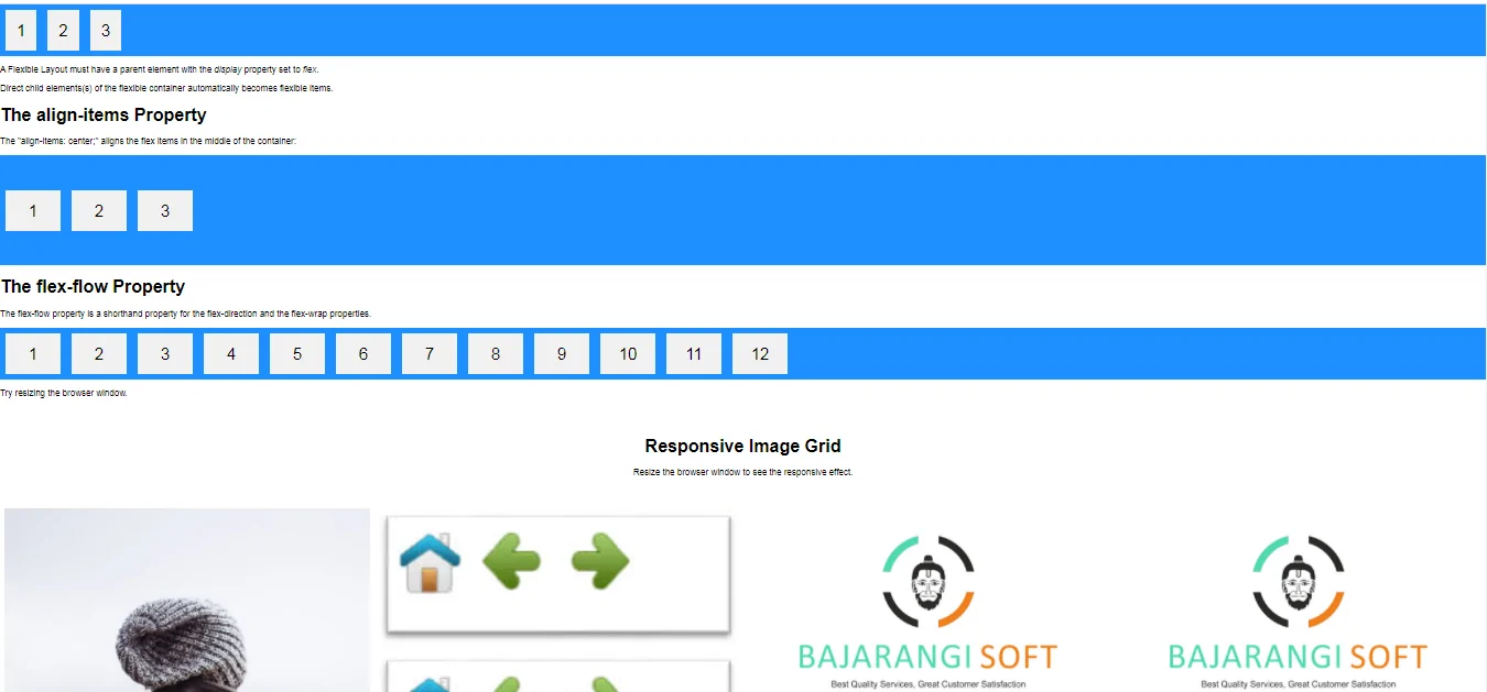
<p>A Flexible Layout must have a parent element with the <em>display</em> property set to <em>flex</em>.</p>
<p>Direct child elements(s) of the flexible container automatically becomes flexible items.</p>
</body>
</html>
<!DOCTYPE html>
<html>
<head>
    <style>
        .flex-container {
            display: flex;
            height: 200px;
            align-items: center;
            background-color: DodgerBlue;
        }

        .flex-container > div {
            background-color: #f1f1f1;
            width: 100px;
            margin: 10px;
            text-align: center;
            line-height: 75px;
            font-size: 30px;
        }
    </style>
</head>
<body>
<h1>The align-items Property</h1>

<p>The "align-items: center;" aligns the flex items in the middle of the container:</p>

<div class="flex-container">
    <div>1</div>
    <div>2</div>
    <div>3</div>
</div>

</body>
</html>
<!DOCTYPE html>
<html>
<style>
    * {
        box-sizing: border-box;
    }

    body {
        margin: 0;
        font-family: Arial;
    }

    .header {
        text-align: center;
        padding: 32px;
    }

    .row {
        display: flex;
        flex-wrap: wrap;
        padding: 0 4px;
    }

    /* Create four equal columns that sits next to each other */
    .column {
        flex: 25%;
        max-width: 25%;
        padding: 0 4px;
    }

    .column img {
        margin-top: 8px;
        vertical-align: middle;
    }

    /* Responsive layout - makes a two column-layout instead of four columns */
    @media (max-width: 800px) {
        .column {
            flex: 50%;
            max-width: 50%;
        }
    }

    /* Responsive layout - makes the two columns stack on top of each other instead of next to each other */
    @media (max-width: 600px) {
        .column {
            flex: 100%;
            max-width: 100%;
        }
    }
</style>
<body>

<!-- Header -->
<div class="header">
    <h1>Responsive Image Grid</h1>
    <p>Resize the browser window to see the responsive effect.</p>
</div>

<!-- Photo Grid -->
<div class="row">
    <div class="column">
        <img src="my_pic.jpg" style="width:100%">
        <img src="my_pic.jpg" style="width:100%">
        <img src="my_pic.jpg" style="width:100%">
        <img src="my_pic.jpg" style="width:100%">
        <img src="my_pic.jpg" style="width:100%">
        <img src="my_pic.jpg" style="width:100%">
        <img src="my_pic.jpg" style="width:100%">
    </div>

    <div class="column">
        <img src="sam.jpg" style="width:100%">
        <img src="sam.jpg" style="width:100%">
        <img src="sam.jpg" style="width:100%">
        <img src="sam.jpg" style="width:100%">
        <img src="sam.jpg" style="width:100%">
        <img src="sam.jpg" style="width:100%">
    </div>

    <div class="column">
        <img src="logo.jpg" style="width:100%">
        <img src="logo.jpg" style="width:100%">
        <img src="logo.jpg" style="width:100%">
        <img src="logo.jpg" style="width:100%">
        <img src="logo.jpg" style="width:100%">
        <img src="logo.jpg" style="width:100%">
        <img src="logo.jpg" style="width:100%">
    </div>

    <div class="column">
        <img src="logo.jpg" style="width:100%">
        <img src="my_pic.jpg" style="width:100%">
        <img src="my_pic.jpg" style="width:100%">
        <img src="logo.jpg" style="width:100%">
        <img src="logo.jpg" style="width:100%">
        <img src="logo.jpg" style="width:100%">
    </div>
</div>

</body>
</html>