
 Posted By
Bajarangi soft ,
Posted On 06-10-2020
Posted By
Bajarangi soft ,
Posted On 06-10-2020
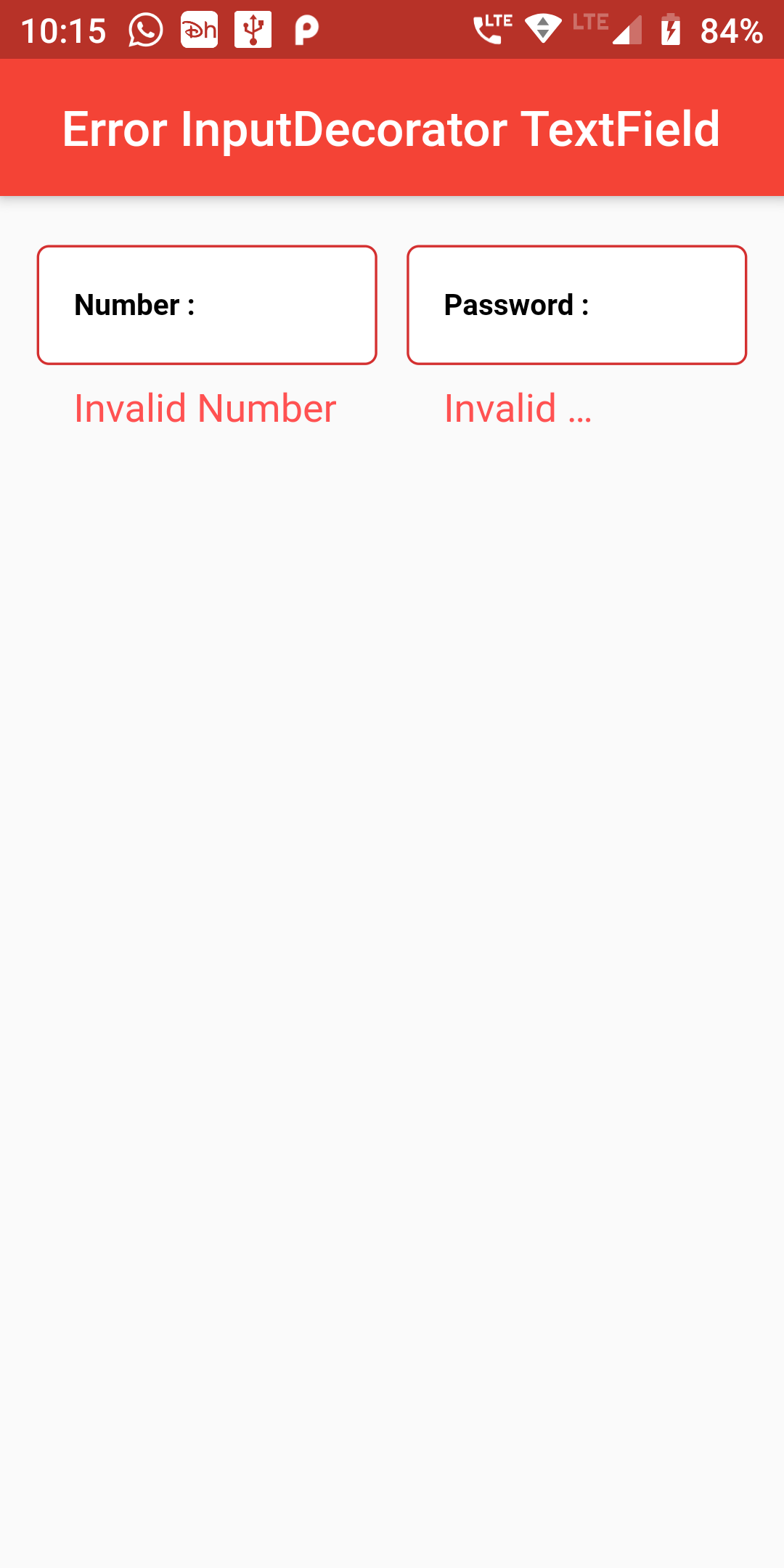
Create a Error InputDecorator Textfield
Step 1: Error InputDecorator Textfield Short Code Example
Container(
  width: MediaQuery.of(context).size.width,
  margin: EdgeInsets.fromLTRB(15, 0, 15, 0),
  child: Row(
    mainAxisAlignment: MainAxisAlignment.spaceBetween,
    crossAxisAlignment: CrossAxisAlignment.start,
    children: [
      Expanded(
        child: FormField(
          builder: (FormFieldState state) {
            return TextFormField(
              autovalidate: true,
              keyboardType: TextInputType.number,
              validator: (String value) {
                if (value.isEmpty) {
                  return 'Invalid Number';
                }
                return null;
              },
              decoration: InputDecoration(
                errorStyle: TextStyle(
                  color: Colors.redAccent,
                  fontSize: 16.0,
                ),
                labelText: "Number :",
                labelStyle: TextStyle(
                  color: Colors.black,
                  fontWeight: FontWeight.bold,
                  fontSize: 12,
                ),
                fillColor: Colors.white,
                filled: true,
                contentPadding: EdgeInsets.all(15),
                border: OutlineInputBorder(
                  borderRadius: BorderRadius.circular(5),
                  borderSide: BorderSide(
                    color: Colors.grey,
                    style: BorderStyle.solid,
                    width: 1,
                  ),
                ),
              ),
            );
          },
        ),
      ),
      SizedBox(
        width: 12,
      ),
      Expanded(
        child: FormField(
          builder: (FormFieldState state) {
            return TextFormField(
              autovalidate: true,
              keyboardType: TextInputType.visiblePassword,
              validator: (String value) {
                if (value.isEmpty) {
                  return 'Invalid Password';
                }
                return null;
              },
              decoration: InputDecoration(
                errorStyle: TextStyle(
                  color: Colors.redAccent,
                  fontSize: 16.0,
                ),
                labelText: "Password :",
                labelStyle: TextStyle(
                  color: Colors.black,
                  fontWeight: FontWeight.bold,
                  fontSize: 12,
                ),
                fillColor: Colors.white,
                filled: true,
                contentPadding: EdgeInsets.all(15),
                border: OutlineInputBorder(
                  borderRadius: BorderRadius.circular(5),
                  borderSide: BorderSide(
                    color: Colors.grey,
                    style: BorderStyle.solid,
                    width: 1,
                  ),
                ),
              ),
            );
          },
        ),
      ),
    ],
  ),
)
import 'package:flutter/material.dart';

void main() => runApp(MyApp());

class MyApp extends StatelessWidget {
  @override
  Widget build(BuildContext context) {
    return MaterialApp(
      debugShowCheckedModeBanner: false,
      home: Scaffold(
          appBar: AppBar(
            centerTitle: true,
            backgroundColor: Colors.red,
            title: Text("Error InputDecorator TextField"),
          ),
          body: ErrorTextField()
      ),
    );
  }
}

class ErrorTextField extends StatefulWidget {
  @override
  ErrorTextFieldWidget createState() => ErrorTextFieldWidget();
}

class ErrorTextFieldWidget extends State {
  Widget build(BuildContext context) {
    return Padding(
      padding: const EdgeInsets.only(top:20.0),
      child: Column(
        children: <Widget>[
            Container(
              width: MediaQuery.of(context).size.width,
              margin: EdgeInsets.fromLTRB(15, 0, 15, 0),
              child: Row(
                mainAxisAlignment: MainAxisAlignment.spaceBetween,
                crossAxisAlignment: CrossAxisAlignment.start,
                children: [
                  Expanded(
                    child: FormField(
                      builder: (FormFieldState state) {
                        return TextFormField(
                          autovalidate: true,
                          keyboardType: TextInputType.number,
                          validator: (String value) {
                            if (value.isEmpty) {
                              return 'Invalid Number';
                            }
                            return null;
                          },
                          decoration: InputDecoration(
                            errorStyle: TextStyle(
                              color: Colors.redAccent,
                              fontSize: 16.0,
                            ),
                            labelText: "Number :",
                            labelStyle: TextStyle(
                              color: Colors.black,
                              fontWeight: FontWeight.bold,
                              fontSize: 12,
                            ),
                            fillColor: Colors.white,
                            filled: true,
                            contentPadding: EdgeInsets.all(15),
                            border: OutlineInputBorder(
                              borderRadius: BorderRadius.circular(5),
                              borderSide: BorderSide(
                                color: Colors.grey,
                                style: BorderStyle.solid,
                                width: 1,
                              ),
                            ),
                          ),
                        );
                      },
                    ),
                  ),
                  SizedBox(
                    width: 12,
                  ),
                  Expanded(
                    child: FormField(
                      builder: (FormFieldState state) {
                        return TextFormField(
                          autovalidate: true,
                          keyboardType: TextInputType.visiblePassword,
                          validator: (String value) {
                            if (value.isEmpty) {
                              return 'Invalid Password';
                            }
                            return null;
                          },
                          decoration: InputDecoration(
                            errorStyle: TextStyle(
                              color: Colors.redAccent,
                              fontSize: 16.0,
                            ),
                            labelText: "Password :",
                            labelStyle: TextStyle(
                              color: Colors.black,
                              fontWeight: FontWeight.bold,
                              fontSize: 12,
                            ),
                            fillColor: Colors.white,
                            filled: true,
                            contentPadding: EdgeInsets.all(15),
                            border: OutlineInputBorder(
                              borderRadius: BorderRadius.circular(5),
                              borderSide: BorderSide(
                                color: Colors.grey,
                                style: BorderStyle.solid,
                                width: 1,
                              ),
                            ),
                          ),
                        );
                      },
                    ),
                  ),
                ],
              ),
            )
        ]
      ),
    );
  }
}