
 Posted By
Bajarangi soft ,
Posted On 07-11-2020
Posted By
Bajarangi soft ,
Posted On 07-11-2020
Complete Code For Creating Shadow Buttons Using Cascading Style Sheets.
<!DOCTYPE html>
<html>
<head>
<title>How To Create Shadow Buttons Using Cascading Style Sheets</title>
<meta name="viewport" content="width=device-width, initial-scale=1.0">
<link rel="stylesheet" href="https://maxcdn.bootstrapcdn.com/bootstrap/3.3.6/css/bootstrap.min.css"/>
</head>
<style>
body{
background: #ffcccc;
}
.button {
background-color: #4CAF50; /* Green */
border: none;
color: white;
padding: 15px 32px;
text-align: center;
text-decoration: none;
display: inline-block;
font-size: 16px;
margin: 4px 2px;
cursor: pointer;
-webkit-transition-duration: 0.4s; /* Safari */
transition-duration: 0.4s;
}
.button0 {
box-shadow: 0 8px 16px 0 rgba(0,0,0,0.2), 0 6px 20px 0 rgba(0,0,0,0.19);
}
.button1 {
box-shadow: 0 8px 16px 0 rgba(0,0,0,0.2), 0 6px 20px 0 rgba(0,0,0,0.19);
}
.button2:hover {
box-shadow: 0 12px 16px 0 rgba(0,0,0,0.24),0 17px 50px 0 rgba(0,0,0,0.19);
}
</style>
<body>
<br/><br/>
<div class="container">
<br>
<div class="text-center">
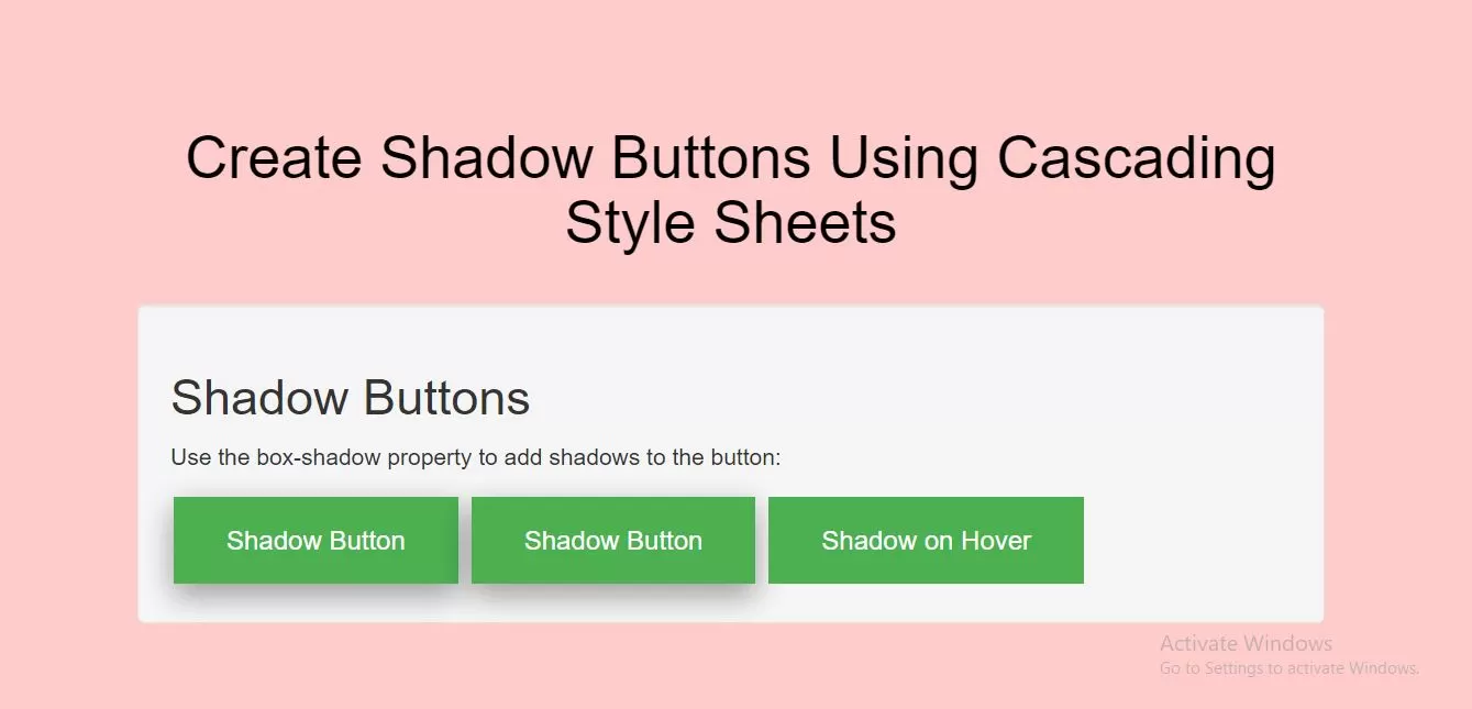
<h1 id="color" style="color: black;">Create Shadow Buttons Using Cascading Style Sheets</h1>
</div>
<br>
<div class="well">
<h2>Shadow Buttons</h2>
<p>Use the box-shadow property to add shadows to the button:</p>
<button class="button button0">Shadow Button</button>
<button class="button button1">Shadow Button</button>
<button class="button button2">Shadow on Hover</button>
</div>
</div>
</body>
</html>