
 Posted By
Bajarangi soft ,
Posted On 07-11-2020
Posted By
Bajarangi soft ,
Posted On 07-11-2020
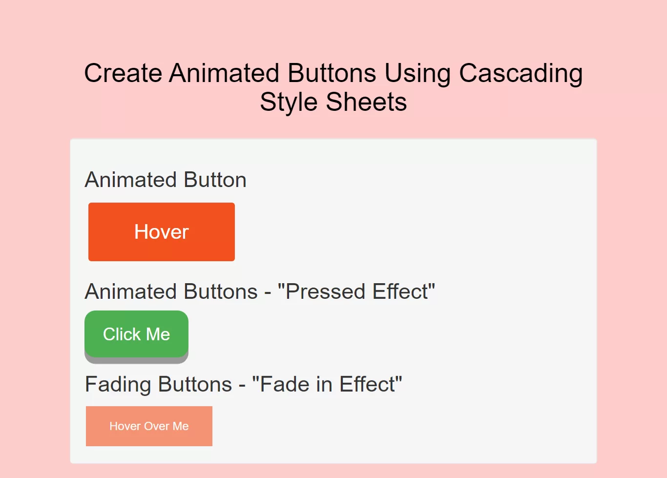
Complete Code For Creating Animated Buttons Using Cascading Style Sheets.
<!DOCTYPE html>
<html>
<head>
    <title>How To Create Animated Buttons Using Cascading Style Sheets</title>
    <meta name="viewport" content="width=device-width, initial-scale=1.0">
    <link rel="stylesheet" href="https://maxcdn.bootstrapcdn.com/bootstrap/3.3.6/css/bootstrap.min.css"/>
</head>

<style>
    body{
        background: #ffcccc;
    }
    .button {
        display: inline-block;
        border-radius: 4px;
        background-color: #f4511e;
        border: none;
        color: #FFFFFF;
        text-align: center;
        font-size: 28px;
        padding: 20px;
        width: 200px;
        transition: all 0.5s;
        cursor: pointer;
        margin: 5px;
    }

    .button span {
        cursor: pointer;
        display: inline-block;
        position: relative;
        transition: 0.5s;
    }

    .button span:after {
        content: '\00bb';
        position: absolute;
        opacity: 0;
        top: 0;
        right: -20px;
        transition: 0.5s;
    }

    .button:hover span {
        padding-right: 25px;
    }

    .button:hover span:after {
        opacity: 1;
        right: 0;
    }
    /*button*/
    .button1 {
        display: inline-block;
        padding: 15px 25px;
        font-size: 24px;
        cursor: pointer;
        text-align: center;
        text-decoration: none;
        outline: none;
        color: #fff;
        background-color: #4CAF50;
        border: none;
        border-radius: 15px;
        box-shadow: 0 9px #999;
    }

    .button1:hover {background-color: #3e8e41}

    .button1:active {
        background-color: #3e8e41;
        box-shadow: 0 5px #666;
        transform: translateY(4px);
    }
    .button2 {
        background-color: #f4511e;
        border: none;
        color: white;
        padding: 16px 32px;
        text-align: center;
        font-size: 16px;
        margin: 4px 2px;
        opacity: 0.6;
        transition: 0.3s;
        display: inline-block;
        text-decoration: none;
        cursor: pointer;
    }

    .button2:hover {opacity: 1}
</style>

<body>
<br/><br/>
<div class="container">
    <br>
    <div class="text-center">
        <h1 id="color" style="color: black;">Create Animated Buttons Using Cascading Style Sheets</h1>
    </div>
    <br>
    <div class="well">
        <h2>Animated Button</h2>
        <button class="button" style="vertical-align:middle"><span>Hover </span></button>
        <h2>Animated Buttons - "Pressed Effect"</h2>
        <button class="button1">Click Me</button>
        <h2>Fading Buttons - "Fade in Effect"</h2>
        <button class="button2">Hover Over Me</button>
    </div>
</div>
</body>
</html>